
Saturday, May 25, 2013
Sketchbook Drawings 8
This is the last drawing that I did in my sketchbook for last quarter's drawing class. Since my theme for the whole sketchbook was man-made forms vs. organic forms, I decided to do a drawing that showed both working together. I thought the perfect thing to draw for this was the fountain in Forsyth Park here in Savannah. It's a very pretty fountain surrounded by lots of fantastic trees and flowers, a great combination of the man-made and the natural.

Friday, May 24, 2013
Color Theory and Concept Art!
This was probably the project I was most excited for last quarter. My color theory teacher let us choose what medium to use as well as what kind of project we wanted to do. The only requirements were related to color use but other than that it was completely open. It was the perfect opportunity to create some digital concept art, so that's what I did. To fit within the project requirements, I chose a split complementary color scheme, and I had to incorporate atmospheric perspective. I'm happy with the result for the purposes of the assignment and for the amount of time I had to complete it, but I'll probably revisit this concept and try to do it better sometime in the future.

Wednesday, May 22, 2013
Sketchbook Drawings 7
These two sketchbook drawings had to be done with an analagous color scheme and I also had to crop the composition. I chose to use colored pencil for both. The first drawing is a zoomed in view of the cockpit on a WWII-era fighter plane. The second drawing is a cropped view of the trees and Spanish moss that can be found in almost every Savannah square. I think the second drawing works much better than the first, both compositionally and color-wise.


Monday, May 20, 2013
Color Theory Using Cut Paper
For this color theory project, I had to pick a photo and recreate certain sections of it in several different ways. One section had to be grayscale, another had to be monochromatic, another had to be a complementary color scheme, and another section had to match the actual colors as close as possible. All of it had to be done with Color-Aid paper, which means that each section is a puzzle of little pieces of cut paper. Like the optical mixing project I posted before, cut paper gives great results, but the process is much too frustrating and tedious for me to enjoy.


Saturday, May 18, 2013
Sketchbook Drawings 6
For these, the requirement was to use ink wash. I like doing ink wash, but I'm not so great at it yet. In the first drawing, I experimented with adding line using a bamboo nib. However, I didn't let the wash dry enough before adding the line so it bled quite badly in some areas. In the second drawing, I definitely overdid it a bit, which resulted in really muddy values. These are definitely not my most successful pieces of art, but I learned a lot about using ink wash, which is a medium that I was not very familiar with.


Friday, May 17, 2013
Color Theory - Optical Mixing
In my color theory class last quarter, one of the assignments was an optical mixing project. This means putting very small dots or hatches of different colors very close together so that the eye blends them and you see a completely different color.
Because the focus of this project was on optical mixing, I didn't have to create my own image. Instead, we were allowed to use an existing image that had interesting colors. I chose to recreate a postcard for one of my favorite graphic novels, reMind. It's a fantastic story written and illustrated by Jason Brubaker. You can read the entire story online here: www.remindblog.com and you can buy both volumes of reMind on Amazon.
So here's is the finished product! I have to say that optical mixing looks pretty awesome, but I really don't like the process. It's much too tedious and scientific for me to enjoy.


Here are some process pictures to show how I built up the colors:


Wednesday, May 15, 2013
Sketchbook Drawings 5
For this set of sketchbook drawings, the requirement was to incorporate an overlay. These two were definitely my favorites out of the whole sketchbook.
In the first image, I drew line drawings of different leaves on a piece of vellum (similar to tracing paper) and I glued different colored rectangles on the page beneath the vellum. These color swatches are actually leftover pieces from color mixing assignments from my color theory class. I tried to line up the green and yellow rectangles with the position of the leaves as an abstract suggestion of their actual color.

In this drawing, I used a similar approach by putting the line drawing on top but this time I used Prismacolor markers to put color underneath. I felt like an animator while doing this drawing because I had to keep flipping the vellum up and down to make sure I was lining the colors up correctly. I also tried to keep the coloring of this piece very loose.

Monday, May 13, 2013
Tightly Rendered Graphite Botanical Drawing
Since drawing class last quarter was all about trying out different techniques and materials, one of the assignments was to do a very tightly rendered graphite drawing of some sort of plant. It took a long time to build up the value in this drawing, because it had to be so tightly rendered that there wouldn't be any visible pencil strokes. The process is a little too slow and tedious for me, but I had never tried it before so I still learned a lot from it.
The first image is the structural line drawing and the second is the finished product.


Wednesday, May 8, 2013
Sketchbook Drawings 4
Here's some more drawings from my sketchbook for last quarter! That week we had to do analytical drawings. I decided to experiment a little bit by layering different colors for the different stages of developing a structural drawing. Then I drew with black for the final lines. I kind of count this as a turning point in my sketchbook as well. With the first six drawings, I tried to do one drawing of a man-made object and one drawing of a natural object to show the contrast in mechanical forms vs. organic forms. Here, I started to look for organic forms in man-made objects as well. I still tried to focus on the difference between organic and non-organic forms, but I didn't limit myself to one man-made thing and one natural thing.


Thursday, May 2, 2013
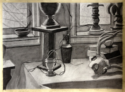
First Pastel Still Life!

The last project for my drawing class last quarter was this color still life. I have to say, it was quite a challenge. I had only used pastel once before, but not in the way that I used it in this piece. One of the restrictions was that we had to stick to the primary colors and mix the rest. We could only use other colors at the very end if we couldn't manage to mix a certain color with the primaries. If you've used paint before, you may think no problem! However, mixing pastels is nothing like mixing paint. Rather than pre-mixing colors on palette and then applying them, with pastels, you are mixing the colors right on the paper. You also have to pay attention to the order that you layer the colors. If you don't get it right and add too many layers, then the colors get all muddy. I feel like I managed to pull it off pretty well, but it took a lot of work to figure out what I was doing. The only thing I am not as happy with in this piece is the cloth. I definitely didn't capture the folds quite right, and in my opinion it looks a bit flat. Something to improve on for next time :)
Friday, April 26, 2013
Sketchbook Drawings 3
So here's the next set of sketches from last quarter. The requirement for this week was to use pen and ink, and I don't think I did such a good job with it. It was one of the first times I used pen and ink to create a full value drawing, and I still haven't quite got the hang of it. However, I'm going to upload everything whether I like it or not because its all part of the process, good drawings, and bad.


Monday, April 15, 2013
Sketchbook Drawings 2
These are a couple more of the drawings I had to do for my sketchbook last quarter. This time the requirement was to use repetition.
Oh, I suppose I should tell you the theme of this sketchbook before I get too far into it. At the beginning of the quarter, I had to choose a certain topic to explore in my drawings. I chose to show the differences between the forms of man-made objects and natural objects. Every week I tried to pick two subjects that showed that.


Oh, I suppose I should tell you the theme of this sketchbook before I get too far into it. At the beginning of the quarter, I had to choose a certain topic to explore in my drawings. I chose to show the differences between the forms of man-made objects and natural objects. Every week I tried to pick two subjects that showed that.


Sunday, April 14, 2013
Charcoal Still Life
So here's a still life from last quarter. I used one directional hatching to add value this time, which I haven't tried before, and I really like it. Here's the finished piece:


Here's the process I went through to get there. I forgot to take a picture of the line drawing, but the first image is the value block in stage. The second image is after adding a bit of value using one directional hatching.


Friday, April 12, 2013
Sketchbook Drawings
Last quarter I had to keep a sketchbook for my drawing class where I did two drawings a week. Every week we had to use a different technique and/or medium, because it was all about experimentation. I certainly experimented, and it didn't always lead to the best results, but it was a lot of fun anyway. I don't even like most of my drawings but I'm going to post them all anyways. Bad drawings are just part of the journey, and I did learn a lot from each one.
Here are the first two:


Here are the first two:


In these two drawings, the requirement was to use a toned background and to create a focal point. The first one is ok, but I really don't like the second one. I tried using colored pencils for a realistic drawing, which I had never done before, and it didn't really work out.
Thursday, April 11, 2013
Modeling In Maya!
Hello everybody! I'm back with some new stuff! It's the third week of a new quarter here at SCAD and I just finished my first ever project in Autodesk Maya! I'm pretty happy with the way it came out, especially since it was my first time using any 3D modeling program. The assignment was to create a room, and it could literally be whatever kind of room we wanted. I chose to make a futuristic train station/subway:


Maya is quite a complex program, so this was a pretty tough project. I had to spend a lot of time watching online tutorials. It was a lot to figure out in two weeks, but the result was very rewarding. I especially like the lighting I was able to achieve in this scene, which took a lot of experimentation to finally figure out. I thought the lightning was a cool, futuristic effect too :)
Saturday, March 9, 2013
Color Studies
So I'm going a bit out of order here, but I really wanted to get this project up because it's my first attempt at something related to concept art! For color theory we had to create three images that were related, but each image had to have a distinctly different color scheme. I decided to do digital landscape paintings, which was awesome because I could finally practice my photoshop painting skills while working on a school project, rather than trying to do my own digital painting in my very limited free time.
So the first thing I did was draw out a whole page of thumbnails of various ideas:


In this image, I could only use de-saturated hues and shades.

In this last image, I used a color scheme from one of Albert Bierstadt's landscape paintings.

So the first thing I did was draw out a whole page of thumbnails of various ideas:


Then I picked three and went straight into the digital painting. I tried out a different technique during this project too. Rather than doing straight up digital painting, I used the lasso tool to make all the shapes I wanted and then painted within the selection. I was going for more of a graphic look, rather than a highly rendered digital painting, which quite honestly, I just didn't have time for.
There were a few requirements we had to follow for this project. In this first image, I could only use saturated hues and tints.


In this last image, I used a color scheme from one of Albert Bierstadt's landscape paintings.

As much as I liked working on this project, I still think each image needs a lot of work. I would have loved to have a lot more time for this project, but I was only able to work on each of these images for about 2 hours. We had less than a week to do this project from start to finish, and there were also some other aspect to the project too that had to be completed. That's why I'm simply calling these color studies rather than digital paintings. Anyways, I hope you enjoyed this post!
Saturday, January 26, 2013
Toy Animal Study Finished Project
Hello everyone! Before I get down to business, I'd like to celebrate the fact that this is my 50th post! If you've been keeping up with my blog for a while, thank you for the support! If you're new, thanks for taking a look and I hope you'll stick with me as I record my artistic journey!


So, now to the art. I've been working on this piece for the past few weeks and I think it turned out really well!
Here's the first stage of the final piece, where I sketched out the toy animal and broke it down into it's basic shapes. Most of the time I spent on this drawing was during this phase, because it's more important to get the correct proportions and alignment than anything else. Once that is all set, adding value is easy.

Once the proportions are correct and the planes are all mapped out, adding value is very simple. A key part of this project was using value to create an area of emphasis, so I built up a lot of value in the head of the bottom figure and left the other two figures less developed. I also shaded in the background in select areas so that it was very clear where the area of emphasis was. Overall, I feel that I accomplished what I was going for with this piece. (Sorry that this image is so much more red than the last one. The pictures were taken at two different times with different lighting, and my camera kept trying to correct the photo since it was so dominantly warm)

Sunday, January 20, 2013
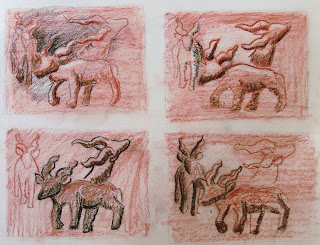
The Development Process for my Next Project
Hey I'm back! It's been quite a long time, but I've started school again and finally have some new artwork to show! These first few drawings show the process I am taking to develop my first project for my Drawing II class. I have to draw the same toy animal three different ways to create a good composition. My teacher is basically having us create our own studies in the same style as studies done by the masters like Da Vinci and Michaelangelo.
The first step is thumbnails, which help to quickly establish a good composition:


After that we had to pick our best thumbnail and do several comps. This step is to establish where the focal point will be in the final drawing and how it is going to be emphasized:
That's most of the work I had to do before even getting to the final drawing. A new post about that will be up by mid-week the latest, so make sure to keep checking back!
The first step is thumbnails, which help to quickly establish a good composition:


Next is a practice drawing of our toy. The goal was to focus on getting the right proportions and angles, and making sure everything on the animal lined up right:


That's most of the work I had to do before even getting to the final drawing. A new post about that will be up by mid-week the latest, so make sure to keep checking back!
Subscribe to:
Comments (Atom)