Friday, September 28, 2012

Nonobjective Contour Drawings

My second Design project was to zoom in on an object really close and make a contour drawing of what I saw. We were supposed to focus on making a dynamic, balanced, asymmetrical composition, as well as utilizing the rule of thirds and diagonals. These are the twelve contour drawings that I did of various objects:

This is a complete view of one side of the paper. There are 6 more on the other side, which you can see in the details below, but I forgot to take a picture of the other side as a whole.

The following 2 drawings are of a twisty lightbulb, or whatever you call them (the eco bulbs). Out of all the 12 drawings, the one of the left is the one that I personally like best.


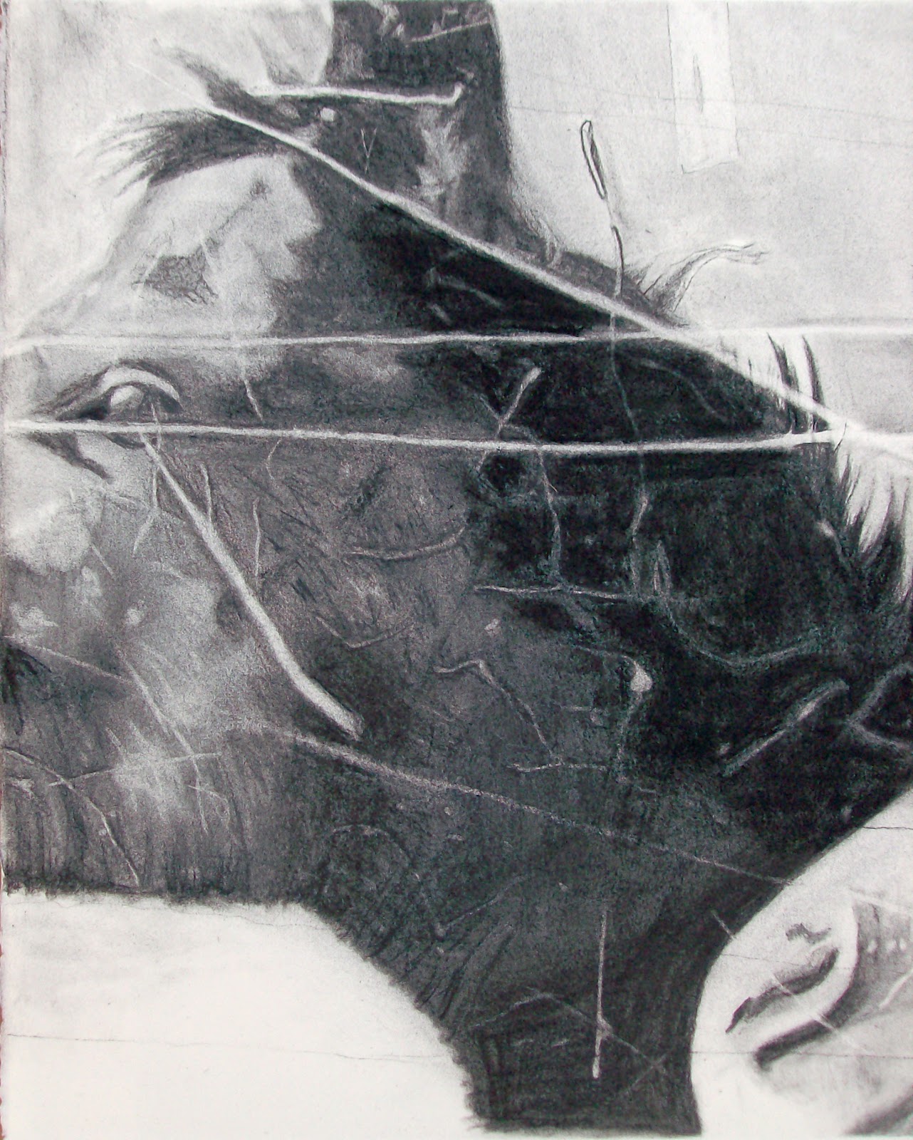
Out of the following 2, my teacher liked the one on the right best out of the 12, so that's the one I ended up going with for my final project, even though I like the twisty lightbulb one above best.


After developing these contour sketches, we had to pick one and turn it into a black and white composition using black micron pens and a black copic marker on bristol board. We had to focus on creating balance by making certain shapes and lines black while keeping other shapes and lines white. I picked the one the teacher liked best. It was a fun project, but I really wanted to do the twisty lightbulb one. if I have time I might do that one for myself. I'll have to upload the final project later after the teacher grades it because we had to hand it in earlier this week and I didn't have a chance to photograph it yet.

Wednesday, September 26, 2012

Alphabet Photography

The first assignment for my Design class was to walk around Savannah and find the entire alphabet as it naturally appears. Basically we had to look around us at the buildings, the sidewalk, the trees, and whatever else we saw, looking for shapes that looked like the letters of the alphabet. We then edited the pictures in Photoshop and arranged them on an 18in X 24in poster, which was then printed at the college design center. I kind of rebelled a little bit, because my teacher had really strict guidelines about the margins around the edges. Her requirements were that the top and side borders had to be 1/2" but the bottom was supposed to be between 3" and 4." I thought that looked awful and unbalanced, so I made the top and side margins slightly larger and the bottom margin around 2 1/2". After all, I was paying to get it printed (that's college for you), so I didn't want to pay for something I didn't even like. This is what it looks like:


Tuesday, September 25, 2012

"Into Focus" Horses

The next thing we did in my drawing class after the ballpoint pen drawings was a charcoal drawing. My teacher called it an "Into Focus" charcoal drawing because of the method we used to draw. First, my teacher started with an extremely blurry image on screen. It was literally a big gray blob and a big black blob. As my teacher changed slides, the image slowly came into better and better focus. By the end of class (2 1/2 hours later), this is what I had:


The assignment for the weekend was to finish the drawing. So I spent another 7-10 hours finishing all the details. This is how it came out:


So now that you've seen my drawing, here is the actual picture that I was working off of:


Hope you enjoy the artwork!

Monday, September 24, 2012

Draw Until the Pen Runs Out

Yes, my teacher literally passed out a brand new Bic pen to everyone in the class and told us to draw until the pen ran out. The only other requirement was that our drawing had to show what home meant to us. It could have been a literal scene (like mine) or some idea that wasn't necessarily real. It was basically a "welcome to drawing class" assignment, so it was really open ended. I managed to make the pen run out though (Well, I may have scribbled frantically on another piece of paper towards the end). All I know is that my hand has never been more sore! It was so cramped by the end that it was not doing what my brain was telling it to do. Anyways, here is the finished result. It came straight out of my head with no references, so it's got a lot of room for improvement, but overall it didn't come out that bad.


Friday, September 21, 2012

College Update!

Ok so I know I really slacked off over the summer as far as creating and uploading artwork goes but I am officially back! I just got through my first 2 weeks of college at the Savannah College of Art and Design (SCAD). It's been kinda crazy, but I am enjoying all of it. It seems like I will be pumping out tons of artwork between my 2 studio classes and the various workshops that SCAD offers for free. So, I'm going to do my best to upload all of it here. I'm going to try really hard to update regularly, but I can't guarantee it. Anyways, let's get to the good stuff. Here's the first thing I had to do for my drawing class: