So back to some more traditional art. This is the second acrylic painting I have ever done in my life (which, so far, is not many haha). The school assignment was to make a fantasy landscape. It could be anything we imagined, as long as it was some type of environment. I chose to go with a barren, icy tundra with a hulking, jagged projection of ice in the foreground, and jagged, icy, mountains in the background. Some reference pictures of actual icebergs helped with the color and texture of the ice, but most of the painting came straight out of my head. I am relatively happy with how it came out, however I believe the mountains in the background could use a bit of help. (It was my first attempt at painting any type of mountain, and I quickly figured out that they are rather difficult to paint correctly. Some more practice in that area is definitely needed :] haha)
This project was extremely fun to do, because it was one of the few things that we've done all year that wasn't based on some type of realism, or focused upon some type of technique or subject matter. The project was extremely open-ended, and allowed for some extra creativity, which is always a plus. This piece is also more like the kind of art I want to do more of, so I was very excited to get started.
So here's even more variety! This was some Harry Potter fan art that I did about a year and a half ago. (If you aren't familiar with Harry Potter, it's a dementor, as I originally envisioned it in my head). I used a Wacom Intuous 4 graphics tablet to draw this digitally in Photoshop CS4. The dementor was drawn entirely in Photoshop, from sketch to finish, using a few different layers and simple brushes. The background was a combination of a cloud brush I have and some filters, all different colors and at different opacities. I would consider this to be my first real digital painting, and I was very proud of how it came out.
I wish I had more of this type of work to show now, but with school, and sports, and the other thousand things I do, I don't have too much spare time for my own art. So, this will probably be the only digital art for some time. I hope to do more digital art once I graduate from high school in June. But for the upcoming weeks, I will be back to posting my schoolwork: traditional pieces of some kind or another.
As always, thoughts and feedback would be awesome!
So here's another sketch. I think one of the strongest aspects of this sketch is the folds of the cloth in the background. To get the right effect, I really concentrated on the shading of, as well as how the folds affect the shadows cast from the scissors. Other than that, I don't really have much to say. Hope you enjoy!
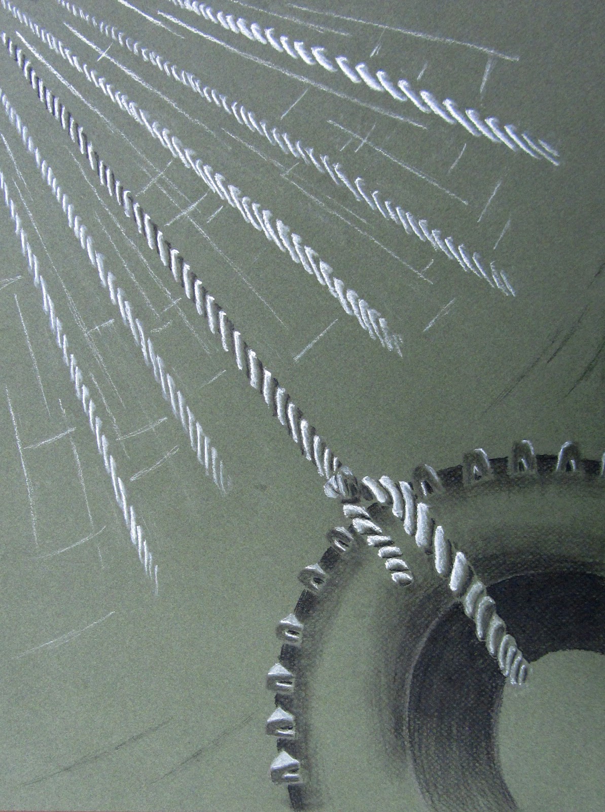
These are two more pieces for my AP Studio Art concentration in school. The first image goes together with the other video game image from my first concentration post. It is actually the same pose from the opposite angle. I was going for the same dramatic perspective as in the other piece, and I think I captured it fairly well. I was also exploring the effects of yet another paper color.
The second image was inspired by memories of a tire swing that I made with my sister and our two best friends when I was a lot younger. I was trying to make the image look more like a memory of swinging on a tire swing, rather than depicting an actually moving tire swing. That's why I made the swaying ropes lighter, my attempt to give them a transparent, ghostly feel, which hopefully sends the message that they're not really there. Despite the concept behind this piece being a bit more complex, the composition is fairly simple, but I think it works well. I also tried to give this piece an interesting perspective, which is something I enjoy exploring in my work.
As usual, comments and feedback about my work are always welcome!
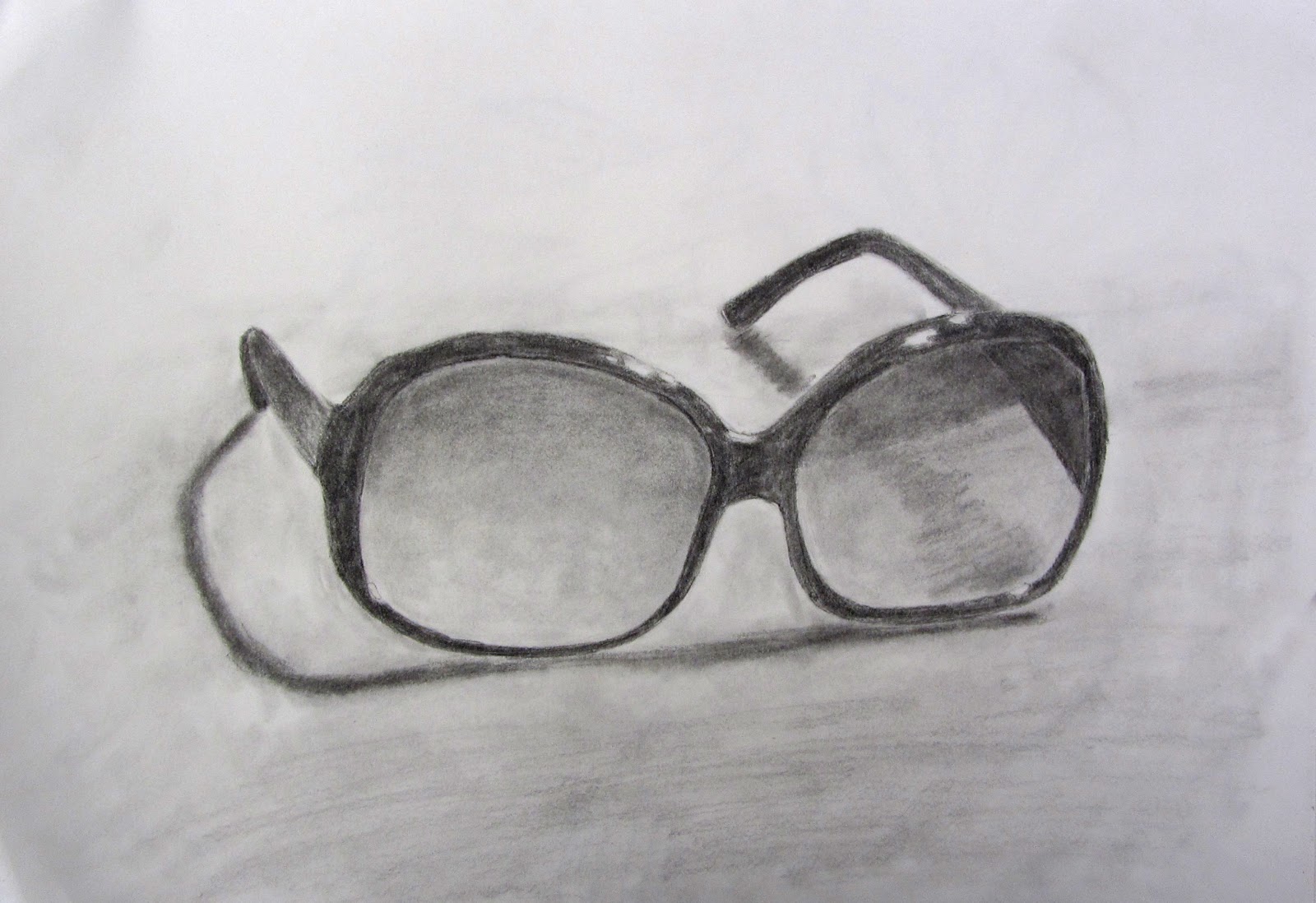
So here's another early sketch. I was pretty happy with the way this one came out. I think I definitely captured the essence of what these sunglasses looked like. I still could have pushed the value a bit by making the highlights pop out a little more, but overall I don't have much to say about this one.
By the way, I'd like to let you know that all of the "Sketch" posts took somewhere between 45 and 90 minutes long.
Sorry about this post being quite late, but I was really busy last week. There will be another one up tomorrow though, and hopefully school won't interfere with my update schedule again!
Hey everybody, I'm really sorry, but I'm really slammed with homework this week. I've got a 5-7 page research paper due Thursday, a sociology project due Wednesday, and about three more hours of English homework, so my next post is going to be a bit late. I'm hoping to get it up by Thursday, but it will definitely be up on Friday.
So this week I am switching it up again. These two pieces are part of my concentration for my AP Studio Art class in school. All of my pieces are centered on the theme of childhood, either things I played with while I was younger, memories, or activities that I used to do. I am also exploring in more detail the technique of using black and white charcoal on a toned background. I really like the look of this kind of medium and I enjoy the process of bringing out both shadows and highlights. I am aslo experimenting with different paper colors and the effect that it has on the overall drawing.
The first drawing consists of some trucks that I used to play with. I had to do some considerable digging in my basement to find them :P. I chose to use brown paper because I thought it would give it somewhat of a vintage feel. I'm not sure if I accomplished this, but I think it worked well anyway. I also wanted to really stress the contrast between light and dark in this piece, which I think is its strongest aspect.
The second piece is actually my twin sister, who was kind enough to model for me ;). This one is pretty self-explanatory. I used to play a lot of video games when I was younger(okay well I still play a lot of video games haha). I chose the dark colored paper because the picture was very dark, and I usually ended up playing video games with just the TV on, so I wanted to capture that dark atmosphere. I also thought it would be cool to do this piece from a very exaggerated perspective. The foot was quite tricky to draw and I still don't think I got the shape right, but overall I think this piece came out well.
These are the first two pieces that I have done so far, and I now have five, so I will be uploading those in weeks to come. These pieces are my most recent works of art, so I figured it would be interesting to compare where I am now with some of my first pieces of art. Next week I will go back to one of my early sketches, but you can expect quite a variety from here on out.